Email Template Size Calculator
Set the email width, padding and columns to get every content and image width, or paste an email's HTML to check its sizes.
Recent
Your last 10 settings, saved only in this browser. Nothing is uploaded.
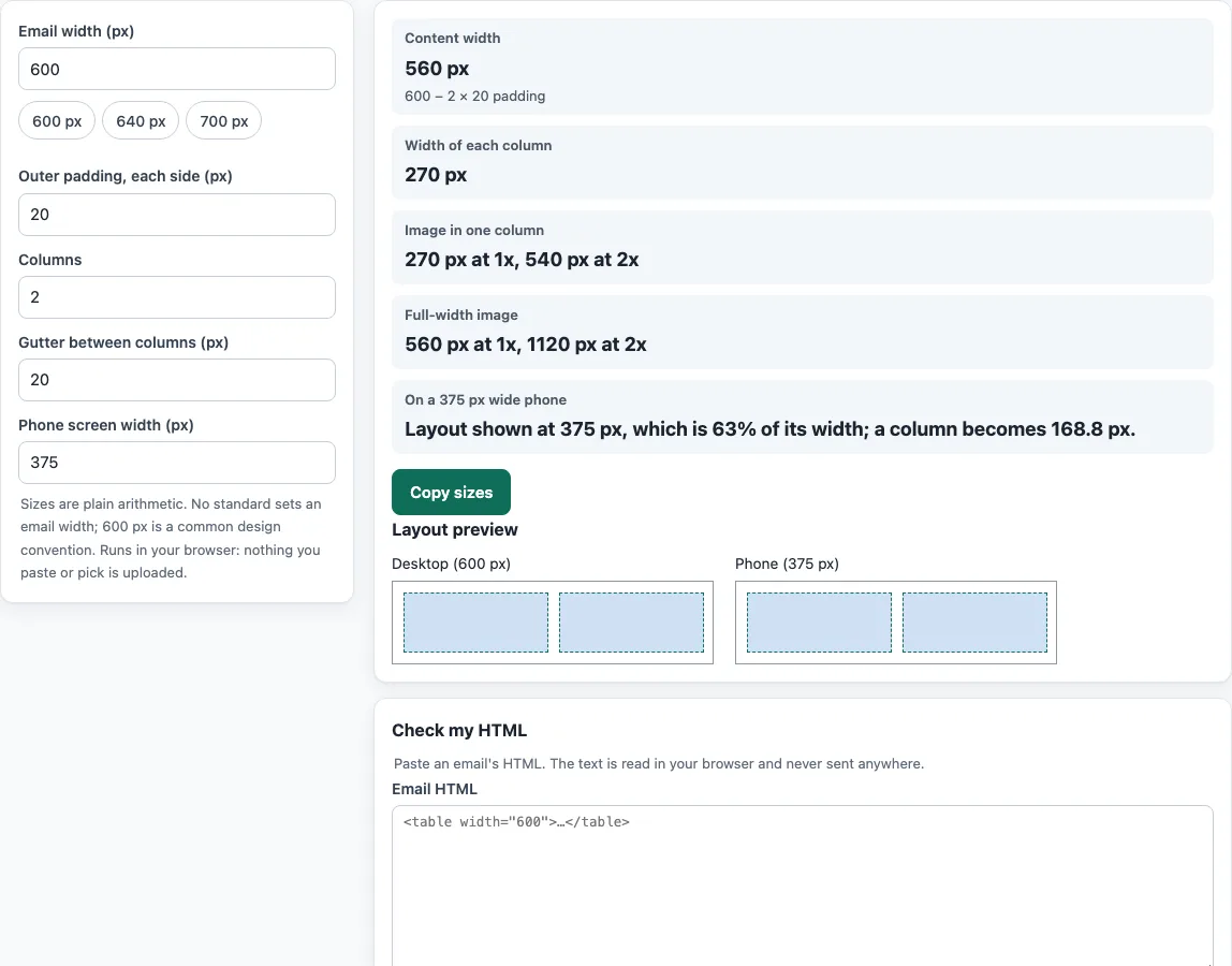
How to use the email template size calculator
- Enter Email width in pixels. If you have no other target, 600 px is a common starting point.
- Enter Outer padding, the space between the edge of the email and its content on each side.
- Enter Columns, the number of columns in your layout. Use 1 for a single-column email.
- Enter Gutter, the space between neighboring columns.
- Read content width and column width from the results.
- Read the image widths at 1x and 2x. Use the 1x width for the displayed size and the 2x width for the file you export for sharper display on high-density screens.
- Look at the scaled preview at desktop width and at phone width to see how the layout shrinks.
- Paste your email HTML into Check my HTML to see its size in KB, the widest fixed widths it uses, and any images without a width attribute or alt text.
Work through the calculator first, then paste the finished HTML into the checker. Fix any fixed widths the checker reports so they match the numbers you calculated.
Keep the numbers from the calculator next to you while you build: the column and image widths it gives are the values to type into the width attributes of your tables and images.
What is the standard email template size?
No standard fixes the width of an email. A width of 600 px is a convention that many templates follow, and the major mail providers’ help pages do not set a required size. Choose a width, then use the calculator to size everything inside it.
How do I work out the content width of an email?
Subtract the padding from both sides of the total width. The formula is content = total width − 2 × outer padding. For a 600 px email with 20 px of padding on each side, the content width is 560 px.
How do I calculate column and image widths?
Subtract the gutters between columns, then divide what remains by the number of columns. The formula is column = (content − gutter × (columns − 1)) ÷ columns. A 560 px content area with two columns and a 20 px gutter gives columns of 270 px. A 2x image is twice the column width, so it would be 540 px wide in the exported file, while the 1x display width stays at 270 px.
Why does the phone preview look smaller than the desktop preview?
A fixed-width layout is shown at its full width and then scaled down to fit the screen. The preview shows this scale factor as viewport ÷ total width. A fluid layout instead shows a width of the smaller of the total width and the screen width. Real mail programs differ in how they handle both cases, so the preview shows the arithmetic, not exact rendering.
What does the HTML size check measure?
It counts the UTF-8 bytes of the pasted text and divides by 1024 to give KB. Long messages can be clipped by some mail services, so the size matters. Images linked by URL add little to this count, while images embedded as base64 text add a lot.
Phones show the same HTML in a narrower space, so a layout with fixed widths has to shrink as a whole, while a fluid layout can stack columns.
Sources (checked 13 October 2026): Can I email · Can I email (2) · Can I email (3) · HTML Standard
Frequently asked questions
Is the tool free, and is anything I paste uploaded?
The tools are free and need no account or sign-up. Everything runs in your browser, so nothing you type, paste or open is uploaded. The checks read only what you paste or open. They do not send email, look up DNS records or see sender reputation.
Is 600 px the required width for an email?
No. 600 px is a widely used convention, not a standard. You can choose any width that suits your design, then use the calculator to size the content inside it.
Why is my email clipped in Gmail?
Gmail is widely reported to clip messages whose HTML is larger than about 102 KB, showing a “[Message clipped]” notice with a “View entire message” link. Google does not document this limit in its Gmail Help pages, so treat it as a reported figure. Paste your HTML into the checker to see its size.
Should I use the width attribute or the CSS width property?
The width attribute has the broadest support. The CSS width property is only partly supported in Outlook for Windows 2007 to 2019, and max-width is not supported in Outlook 2007 to 2016. Table layouts are fully supported, so many templates use a table with a width attribute and add CSS for other styles.
Can I use the templates I make for business purposes?
Yes. Anything the tools produce, such as signatures, footers, templates and images, may be used for any purpose, including commercial use, without attribution.
Related tools
- Email banner size calculator: use it to size banners that sit inside your email width.
- HTML email template: start from a ready-made layout instead of building one from scratch.
- HTML email builder: build an email visually when you want to assemble the layout yourself.
- Email HTML validator: check your HTML for errors before you send it.
- Email font size preview: see how your text sizes look inside the layout you have sized.